.svg)
Chicago, USA
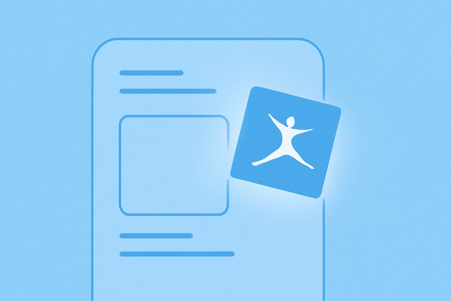
MyFitnessPal’s Macros tool is one of its most powerful premium features, but many users weren’t using it. Our job was to change that.
We partnered with the internal marketing and product teams to craft a user-centered campaign that didn’t just explain the feature, but seamlessly guided users into it.
How do you help people connect with something that’s already there — and make it feel essential?
Users weren’t ignoring the Macros feature — they just didn’t see how it fit into their routine. Many found it too technical or weren’t sure how to get started. For a product built on daily habits, that gap between interest and action was costly.
So we started by listening. Through user behavior data and journey mapping, we identified the points where curiosity dropped off, where language caused hesitation, and where the experience felt more like a wall than a welcome. That insight shaped everything.
We crafted messaging that worked within the user experience — not layered on top of it. Each subject line, each CTA, each in-app prompt became a tool for reducing friction. Instead of pushing users, we invited them in. Instead of selling, we explained. And by developing journey-based message variants, we reflected different levels of familiarity and motivation, allowing users to move at their own pace.
UX thinking, applied word by word.
The result was a reactivation. More users explored Macros, more understood its value, and more began integrating it into their routines.
As one user put it, “Finally!” — proof that good UX and clear language can change how people feel, and what they do.
.svg)