The challenge
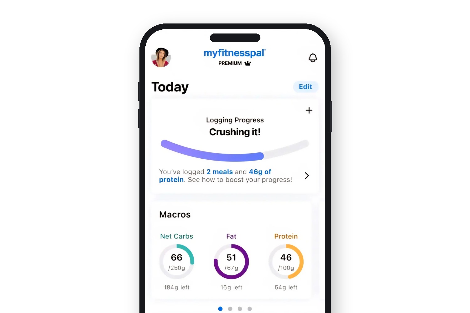
Macros offered committed users more control over their nutrition, but its value was not always clear at the moment it mattered.
Some users never opened the tool. Others opened it and could not immediately see how it fit into their day.
The product worked. The language around it was doing less work. Macros could appear technical before it appeared useful, leaving a gap between curiosity and action. For a product built around daily habits, that gap mattered.
The approach
Behavioral data showed us where users dropped off. Journey mapping helped us understand why.
We rebuilt the messaging at those points: email subject lines, calls to action and in-app prompts that explained the feature without overexplaining it. Journey-based variants met users at different levels of familiarity, from curious newcomers to people returning to the tool.
The campaign was not a layer placed over the product experience. The words became part of how the experience worked.
The outcome
More users explored Macros, understood what it offered and incorporated it into their routines.
The clearest response came from a user who, after the feature finally clicked, wrote one word:
“Finally!”
For a content designer, that is close enough to a standing ovation.
“I’d rank Colin in the top five writers I’ve ever worked with and would hire him again in a heartbeat. Not every great writer is a strategic thinker: Colin is both.”